

This is a hidden article.
Uncategorised
Theme Features
Avanti is featuring brand new and advanced Warp options.
Navigation
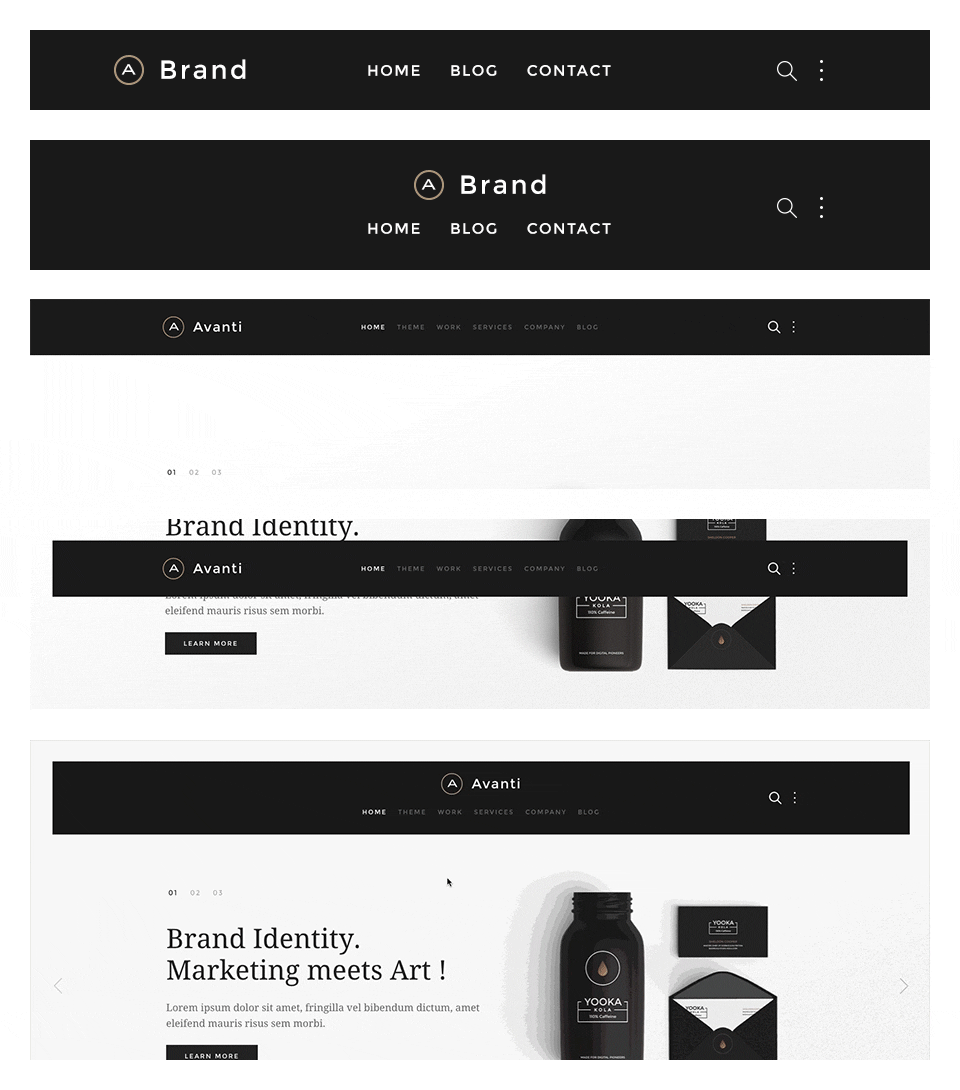
The main navigation of Avanti Theme supports the latest UIkit sticky navigation component features. You are able to select from 3 different navigation behaviors/styles and 2 layouts. The styles and the layouts can be combined. This makes 6 different navigation combinations.
Navigation Styles
- Not Sticky - Default navigation.
- Always Sticky - Floating sticky navigation with spacing around the navigation bar.
- Sticky and Animated - This style floats over the content and sticks to the top of the browser window when you start scrolling down.
Navigation Layouts
- Single Row - The default navbar with the logo on the left side and centered menu items. /layouts/header.default.php
- Centered - Logo and menu items are centered and stacked. /layouts/header.centered.php
If you want to support a bigger logo size or if you want to modify the navbar gutter, please use the Customizer to change the values.
Special navbar positions
- search - The search will be displayed inside a dropdown with automatic focus on the search field.
- more - The same markup as the search, a dropdown which can be used for social icons for example.
If you want to change the dropdown width or color, please use the Customizer to change the values.
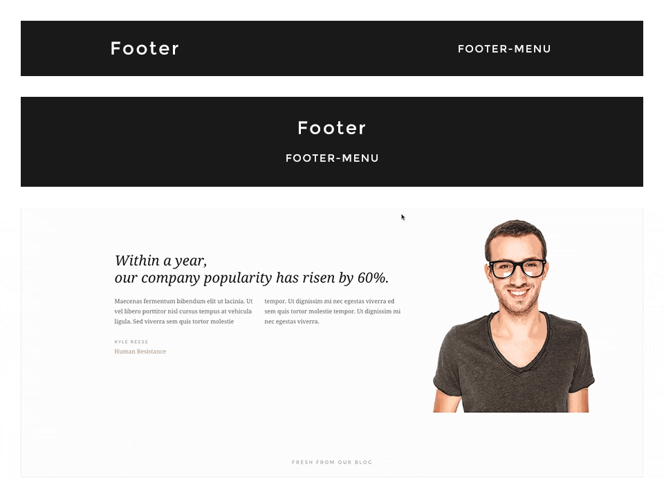
Footer
In this theme you can choose from 2 different footer layouts and combine them with the fixed footer option.
Footer Layouts
- Single Row - The default footer with the footer module/widget on the left side and the footer-menu on the right. /layouts/footer.default.php
- Centered - Footer module/widget is centered and the footer-menu is centered below. /layouts/footer.centered.php
Options
Footer Fixed: This fixes the footer block position and your website will scroll over the footer.
Enable Contrast: This option toggles the uk-contrast class from UIkit. It improves the appearance of elements when placing them on colored or dark backgrounds.
To modify the height of the footer and/or the fixed footer, please change the height values in the Customizer.
Block Appearance
Avanti supports some useful options for all block layout positions. All settings can be combined for a block position. If you need different block settings for different pages, you can use layout profiles and assign them to your menu items.
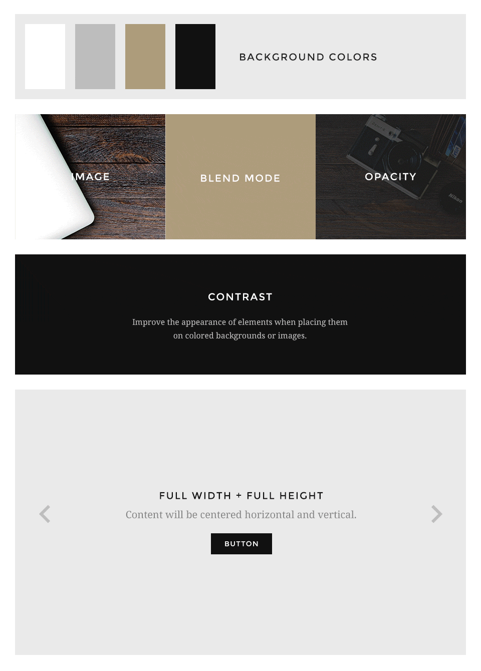
Options
- Background - Choose from 4 different background colors.
- Image - Enter a path to a background image for this position.
- Image Blend - Define how the background image will mix/blend with the background color.
- Image Opacity - Adds an overlay with the same background color of the block and an opacity value.
- Contrast - Enables the Contrast component. Recommended for block positions with a primary background color or image.
- Padding - Select the spacing between the content and its block container.
- Full Width - This removes the constraint of the content container so it will extend to full viewport width. Recommended for full width Widgetkit slideshows, for example.
- Full Height - The block will take up full viewport height. If the navbar is set to default, the navbar height will automatically be subtracted from the subsequent block.
- Grid Collapse - This option will reset the grid gutter and is recommended, if you want to use a full width Widgetkit slideshow or something similar.
- Class - Use this input field for a custom CSS class which will be added to the block.
If you want to modify the background colors or paddings of the block elements, please use the Customizer and change the values.
Other Options
Additionally you have more options to customize your theme layout.
Article Style
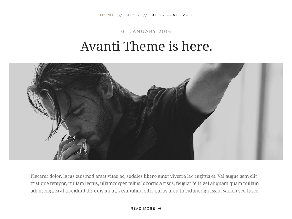
Display blog articles in a special theme specific layout. /layouts/article.php
Breadcrumb
This option centers the breadcrumbs and adds some more spacing to the following elements. Recommend for the theme specific article layout.
Lorem ipsum dolor sit amet, consectetur adipisicing elit, sed do eiusmod tempor incididunt ut labore et dolore magna aliqua. Ut enim ad minim veniam, quis nostrud exercitation ullamco laboris nisi ut aliquip ex ea commodo consequat. Duis aute irure dolor in reprehenderit in voluptate velit esse cillum dolore eu fugiat nulla pariatur. Excepteur sint occaecat cupidatat non proident, sunt in culpa qui officia deserunt mollit anim id est laborum.
Article title

Lorem ipsum dolor sit amet.
Lorem ipsum dolor sit amet, consectetur adipisicing elit, sed do eiusmod tempor incididunt ut labore et dolore magna aliqua.
<div class="myclass">...</div>text-muted
text-primary
text-success
text-warning
text-danger
text-primary
text-success
text-warning
text-danger
ins element
mark element
abbr element
dfn element
mark element
qinsidea q element
abbr element
dfn element
Badge 1 Success 4 Warning 3 Danger 4
h1
h2
h3
h4
h5
h6
Lorem ipsum dolor.
Someone famous
- List item 1
- List item 2
- List item 3
- List item 1
- List item 2
- List item 3
| Table | Heading |
|---|---|
| Table | Data |
| Table | Data |
- Description lists
- Description text.
- Description lists
- Description text.
Headline
Lorem ipsum dolor sit amet, consectetur adipisicing elit, sed do eiusmod tempor incididunt ut labore et dolore magna aliqua. Ut enim ad minim veniam, quis nostrud exercitation ullamco laboris nisi ut aliquip ex ea commodo consequat. Duis aute irure dolor in reprehenderit in voluptate velit esse cillum dolore eu fugiat nulla pariatur. Excepteur sint occaecat cupidatat non proident, sunt in culpa qui officia deserunt mollit anim id est laborum.
Warp comes with a sophisticated layout system to create any kind of sidebar or widget layout. You can easily manage the sidebar's positions and widths in the theme administration. Widgets can have different styles and be placed in any position offered by this theme. Each position has its own layout. You can align widgets side-by-side, stack them or choose your own grid layout. Show or hide widgets on mobile devices, while the grid adapts perfectly to your layout.

- 1
- 2
Author
May 2, 2090 at 1:55 pm
Lorem ipsum dolor sit amet, consetetur sadipscing elitr, sed diam nonumy eirmod tempor invidunt ut labore et dolore magna.